Cover Story: A Breast Cancer Journey
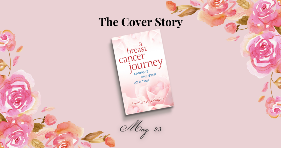
We all judge books by their cover, don’t we? The first impression of a book’s tone, theme, and the overall mood is set by that cover image. If the cover doesn’t grab us, we will move on to something else. When I dreamed of a cover for my book, I wanted something that would impart peace and comfort to you during and after the challenges of breast cancer. I couldn’t have dreamed of a more perfect cover than this one, designed by Karen Polaski at Bold Story Press.
Design Process
One of the wonderful parts about being a Bold Story Press author is that I have an opportunity to work with an experienced and detail-oriented team. While I wrote the manuscript, I benefitted greatly from the many hours of editing, proofreading, and designing the team put into the book. It hasn’t been an easy process to edit and refine, but it has been purposeful.
I thought I’d share a peek into the cover design process in this post. It was a collaborative process, with plenty of places to share my hopes about the cover.
Initial Inputs
One of the first things I was asked to do as a part of the design process was to pick out book covers I liked and share with the team what I liked about them. I was also asked to create a list of book covers I didn’t like and give insights into why I didn’t resonate with them.
As I was pulling together a list of inspirational covers across all book genres, unbeknownst to me, I chose a book cover designed by Karen Polaski, my book designer. When she shared that with me during our design meeting over Zoom, we all had a good giggle.
I also decided to share my personal branding guide with her so she could see what colors and fonts I like to use across my online channels.
During the design meeting, we discussed the mood I hoped the book cover would convey and the types of fonts and colors I gravitated toward. The Bold Story team brought the industry knowledge on what works and doesn’t work in a title and a book cover. Their experience would help guide that initial impression for you, the reader.
Cover Prototypes
After this initial meeting, Karen began designing sample covers for my book. A few weeks later, I had a document with eight potential covers. It was interesting to see how the imagery, fonts, colors, and text layouts contributed to the visual impression of the book.
One design made me catch my breath and stop scrolling. The instant I saw it, I realized that I was actually going to be an author. Seeing my name on the cover was a surreal moment. I kept coming back to that design as I scrolled through all the options.
My favorite part of the cover has to be the lovely pink roses in the background. I have chosen to embrace the rose as a recurring theme across my website and social media because, well, I love roses. (So deep, right?) Also, in France, Breast Cancer Awareness month is called “Octobre Rose.” I love all things French, so if I could infuse some French into my branding in a subtle yet meaningful way, I would.
I am in love with the soft pink roses on the cover, and I can’t wait to see them in print!
The next step in the design process was to share my feedback with the designer. So, I set to work, writing what I did and didn’t like about each cover. I was determined to give clear and specific feedback on each cover since I knew that Karen had put a lot of time into the design process.
After I had written about each cover, detailing what I thought about the imagery, fonts, graphics, and design, I sent it back to the team. 1300 words later, I sent the email to Julianna, my production coordinator.
Cover Decision Time
Her reply was absolutely perfect: “Thank you so much for your thoughtful responses! It looks like 3 is your clear favorite…Do you want to go with that one, or do you want to see different iterations of 4 or any of the others?” Yes, she managed to distill what I was trying to say in 1300 words into a three-sentence email.
#3 was our favorite, and I’m delighted to share it with you. It conveys exactly the mood I hoped to share with you, one of peace, calm, and hope during challenging times.
My journey will not look the same as yours, and that is to be expected. That’s precisely why the title is “A Breast Cancer Journey,” not “The Breast Cancer Journey” or “All Breast Cancer Journeys.” Your journey will have different paths, and I hope this book can help you live it one step at a time.

Interior Layout and Design
After we decided on a cover, Karen sent over some potential designs for the book’s interior. There were several choices with fonts, section headers, and chapter openings.
The designs we chose continue the cover theme throughout the work, creating a cohesive and peaceful mood. I can’t wait to share the interior with you, but that is a reveal for another day.
Once the interior design was finalized, it was time for the manuscript to be laid out on the pages. These page proofs would be sent to a professional proofreader and me for checks and optimization.
In a few days, I should have my second copy of the page proofs, and once those are approved, the book will be finished!
Publishing Date and Preorders
The book’s official launch date will be May 23, and pre-orders will be available soon. Stay tuned for more details and ways you can help be a part of this launch.
In the meantime, join my mailing list, or follow me on social media to keep up to date on the news.
Jennifer Douglas
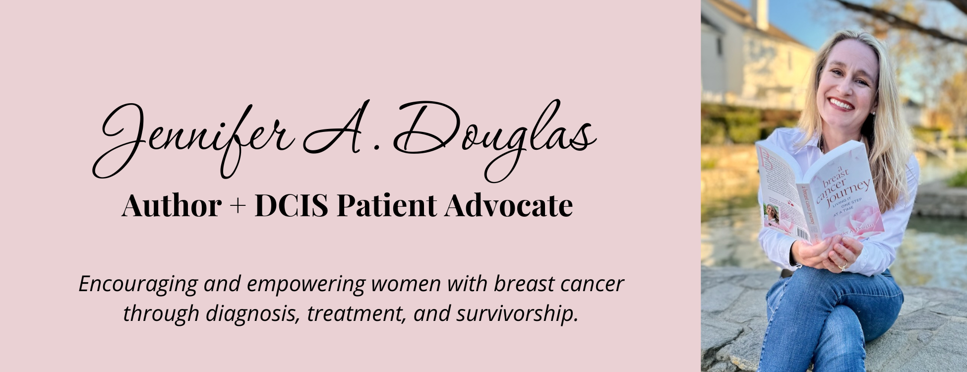
Jennifer Douglas is an author, patient advocate, and DCIS breast cancer survivor. After navigating her own breast cancer journey in 2019, she began writing and encouraging others who were newly diagnosed. Her resources include her book, "A Breast Cancer Journey: Living It One Step at a Time," and her online support course, "Encourage: Breast Cancer and Beyond." Jennifer also actively supports patients through her online presence and direct involvement in communities and support groups, offering guidance and encouragement every step of the way.


You May Also Like

Cancer Survivorship: Living in the In-Between
July 5, 2022
How I Used GoodNotes and my Bullet Journal During Breast Cancer Treatment
April 16, 2021
